


Most small FMCG brands in Malaysia—those doing RM1 million to RM5 million in revenue—never learn this ritual. They buy a Nielsen report, or they get one shared by a friendly retailer, and they treat every number as gospel. They build strategies around market share that does not actually exist. They panic over category trends that are not actually trends. They walk into buyer meetings armed with data they do not fully understand, and they get dismantled by a category manager who does.
Nielsen data is the most powerful tool in FMCG. It is also the most dangerous tool for brands that have not yet learned how to read it. This post is about closing that gap.
What Nielsen Actually Measures (and What It Does Not)
Before we go any further, let me define what we are talking about.
NielsenIQ provides two main types of data. The first is Retail Measurement Services (RMS), also called retail audit or scanner data. This tracks the sales of goods from retailers to consumers at specific outlets in a predefined geographical area referred to as the retail universe. It captures what sells, where, at what price, and in what quantity. The second is Consumer Panel Data (sometimes called household panel data). This is self-reported purchasing data that tracks what actual households buy over time—who bought what, how often, and whether they switched brands.
These two data sets are complementary, but they answer fundamentally different questions. POS data tells you about sales velocity, category ranking, and your most valuable retailers. Panel data gives you insight into consumer behavior, customer loyalty, trial and repeat rates, and who your actual buyer is.
Now here is the critical part: neither of these data sets was built for a brand doing RM5 million in revenue. They were built to help large CPG manufacturers plan trade spend, optimize distribution across tens of thousands of stores, and benchmark category performance with high statistical confidence. The primary bias of scanner data companies is in analyzing retail promotions and their effect on the business. Their analytics get very deep—but that depth assumes a level of baseline velocity and distribution breadth that a small brand simply does not have.
This does not mean the data is useless for you. It means you need to read it differently.
The RM5 Million Blind Spot: Why Nielsen Data Gets Wobbly for Small Brands
Here is the uncomfortable truth: when your brand is small, the very data that is supposed to guide you may be leading you astray.
Let me give you a concrete example. Imagine your brand is in 50 stores across the Klang Valley, doing roughly RM3 million in annual revenue. You pull a Nielsen retail audit report for your category. It shows you have 0.3% market share nationally. Your competitor—a brand you know is only in 80 stores—somehow shows 1.8% share. You panic. You wonder what you are doing wrong.
The answer, most likely, is nothing. The problem is the math behind the number.
When distribution is low, the number of stores stocking your product in the agency’s sample of retail outlets is very small. Many of the advanced promotional analytics may not even work for small brands selling less than $50 million nationally due to scanner data’s projected nature. In other words, the data is statistically noisy—not because Nielsen is doing a bad job, but because the sample size of stores carrying your brand is too thin for reliable extrapolation.
Meanwhile, NielsenIQ’s own broader benchmark data indicates that companies using limited aggregated data are missing out on up to 35% of their market share on average. The data can mislead. It can overstate. It can understate. And it is disproportionately unreliable at the extremes—very large brands and very small brands.
This is the RM5 million blind spot. The numbers look precise. They are presented with decimal points, trend lines, and color-coded heat maps. But the underlying statistical confidence is lower than the formatting suggests. You are reading tea leaves and mistaking the shape of the leaves for a satellite image.
The Metrics That Actually Matter (and the Ones That Are Noise)
So if you cannot trust the big share numbers at your scale, what can you trust? Let me walk through the five Nielsen metrics that actually matter for a small brand, and the three that will waste your time.
Metric #1: Weighted Distribution (Not Numeric Distribution)
Most small brands obsess over Numeric Distribution—the percentage of stores in the market that carry your product. It is easy to understand. It feels like progress. But it is the wrong metric if your stores are not the right stores.
Weighted Distribution measures the sales potential of the stores stocking your brand. It asks: are you in the stores where your category actually sells? A brand in 100 high-traffic premium grocers with a Weighted Distribution of 45% is far healthier than a brand in 300 low-traffic convenience stores with a higher Numeric Distribution but a Weighted Distribution of 18%.
In FMCG, it is not just about being everywhere. It is about being where it matters most and I’ve covered this extensively in my previous posting (you can read more about here if you missed it) so I won’t be explaining further here. Therefore for a brand under RM5 million, every new store you enter must justify itself against this metric. If your Weighted Distribution is not climbing with your store count, you are adding doors that do not contribute.
Metric #2: Velocity (Units Per Store Per Week)
Again, I have written about this at length in a previous post (you can read more about here if you missed it), so I will be brief. Velocity is the single most important health metric for a small brand. It measures how fast your product sells in stores where it is actually available.
A product with high distribution but low retail velocity demands internal optimization—fix pricing, packaging, shelf placement, or awareness. A product with low distribution but high velocity signals untapped potential and makes the case for expansion. If you only track one Nielsen metric, track this one.
Metric #3: Share Among Handlers (SAH)
This is the metric most small brands have never heard of, and it is arguably the most useful for your stage.
Market Share tells you what percentage of total category sales belongs to your brand. Share Among Handlers tells you your market share only among stores that actually stock your product. It answers the question: in the stores where I am actually on the shelf, am I winning or losing?
A small brand with low overall market share but strong SAH has a compelling pitch. You are not saying, “We are tiny nationally.” You are saying, “Where we are present, we perform.” That is the argument a buyer wants to hear.
Metric #4: Trial and Repeat Rate (From Panel Data)
POS data tells you what sold. Panel data tells you whether anyone came back.
Trial Rate measures the percentage of households trying your product for the first time. Repeat Rate measures the percentage of households that return for more. If your trial rate is high but your repeat rate is low, you have a product problem—the packaging or shelf proposition attracted purchase, but the product experience disappointed. If your repeat rate is strong but trial is low, you have an awareness problem, and your focus should be on in-store visibility, content, and demos.
For a brand under RM5 million, this distinction is life or death. Too many small brands celebrate trial without knowing whether anyone returned.
Metric #5: Fair Share Index (FSI)
FSI compares your market share to your share of distribution. An FSI greater than 1 means you are punching above your weight—converting shelf presence into sales more efficiently than your distribution footprint would predict. An FSI below 1 means your distribution is not converting, and you need to diagnose why before adding more doors.
This is the metric that prevents death by distribution. It tells you whether your current footprint is working hard enough before you expand it.
Now, the three metrics that are likely noise for a brand under RM5 million.
National Market Share. At your scale, the number is too small and the sample noise too high. It moves in ways that reflect statistical wobble rather than business reality. Use it directionally, not precisely.
Price Elasticity Modeling. Advanced promotional analytics require large baseline velocities and broad distribution to produce reliable estimates. They will not work for you yet.
Category-Level Growth Rates. The headline growth rate of a RM1Bil category tells you nothing about whether the sub-segment you operate in is growing or shrinking. You need to drill down to your specific price tier, format, and channel before the growth number means anything.
The Delisting Danger: When Nielsen Data Gets Used Against You
Here is a scenario that should keep you up at night.
You are in a buyer meeting at a major Malaysian retail chain. You are presenting your brand’s performance. The buyer pulls out her own internal velocity data and says: “Your USPW is 1.2. Our threshold for this category is 2.0. Why should I keep you on the shelf?”
You are not prepared for this question because your own Nielsen report showed a healthy-looking national share number.
This is the gap between what Nielsen can tell you and what a retailer actually cares about. The retailer measures your performance by what happens in her stores, not by a national projection. If you are not tracking store-level velocity—you are flying blind into the conversation that determines whether your product stays on the shelf.
This is why category math beats founder passion every time. The buyer does not care about your story. She cares about her category performance, her shelf productivity, and her margin. If your data cannot speak her language, you will lose to a brand that can.
The Malaysian Dimension: What the Local Data Actually Says
Before I give you a practical playbook, let me ground this in Malaysian reality, because the market structure here creates unique dynamics for small brands.
Malaysia’s FMCG market is concentrated. The top three players have actually gained share in recent years—unlike in Indonesia, Thailand, and Vietnam where challengers rose. Malaysian shoppers are demonstrating brand conservatism. Economic headwinds drive people to trust well-known brands instead of experimenting. MNC brands hold 51% of value share in Malaysia, an increase of 2% over the last three years.
Modern trade—especially convenience stores and discounters—is growing fast. Forty-seven percent of Malaysian consumers shop at hypermarkets or supermarkets, and 24% at convenience stores. E-commerce share remains small at 3% but is gaining traction. General trade, the traditional kedai runcit, is declining but still accounts for a meaningful share of shopping trips.
Meanwhile, Malaysian consumers are squeezed. Twenty-five percent have switched to better value-for-money brands. Forty-two percent buy the same brand but at a discount. Thirty-three percent are buying less, and 27% buy only essentials. Small cash-outlay packs are rising—sachets, trial sizes, smaller formats.
What does this mean for a small brand reading Nielsen data? It means you must look at the category through the lens of affordability, downtrading, and pack architecture. If the Nielsen data shows your premium sub-segment is flat while the value tier is growing 8%, do not panic about your brand. Ask whether your pack architecture—a RM4.90 trial sachet, a RM12.90 core jar, a RM22.90 bulk format—gives you a presence across every price tier where growth is happening.
The Practical Playbook: How to Read Nielsen Data When You Do Not Have an Analyst
You do not need a full NielsenIQ subscription that costs six figures. You do not need an analytics team. You need focus.
Step 1: Audit Your Category Before You Enter It
Before you spend a single ringgit on production, use Nielsen data or a category snapshot from a retail partner—to answer four questions:
- Is the category growing, flat, or declining? And I mean your specific sub-category—not “sauces and condiments” but “premium chili paste in the RM10-15 range.”
- Is private label squeezing the middle? If the store brand is growing faster than branded products, your pricing strategy needs to account for that.
- What is driving growth—dollar or unit? If dollar growth is strong but unit growth is flat, price increases are masking volume decline. That is a warning sign for a new entrant.
- Where is the white space? What price tier, what format, what channel is underserved?
Step 2: Benchmark Your Performance with Regional Context
NielsenIQ data becomes most useful when you use it to benchmark yourself not against the entire category, but against brands at a similar stage. Manufacturers outside of the top 100 have contributed 31% of annual FMCG growth in the Asia-Pacific region. Small brands, as a group, are often leading as sales growth contributors even when they are not the pace leaders on absolute volume.
Understanding where your growth rate sits relative to other challenger brands—not relative to Nestlé—is the correct frame.
Step 3: Buy Panel Data Only When You Are Ready for It
For many emerging brands, retail POS data is their only source of truth. But there are questions that POS data cannot answer: Who is my actual customer? What percentage of buyers are repeat purchasers? What else is in their basket when they buy my product?
Panel data answers those questions, but it is expensive and requires analytical sophistication. The right time to add panel data is when you have enough distribution that optimizing your marketing spend—rather than simply building distribution—becomes the growth lever. For most brands under RM5 million, that moment has not yet arrived.
Step 4: Build the One-Page Tracker That Actually Matters
Do not try to monitor 80 metrics across 60 markets. That is the trap of “biting off more than you can chew,” and it is the single most common mistake small CPG manufacturers make with Nielsen data.
Instead, build a one-page tracker with five numbers, updated quarterly:
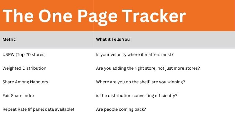
If those five numbers are moving in the right direction, ignore the noise. You are building a healthy brand.
Still in doubt? In my next posting, I will share with you my Nielsen Audit Checklist to understand if you have the right data metrics to measure where your brand stands
The One Thing to Remember
Here is the truth I have learned from two decades of sitting on both sides of the FMCG table.
Nielsen data is a compass, not a map. It tells you which direction you are heading. It does not tell you what is around the next corner.
For a brand doing less than RM5 million, the most dangerous thing you can do is treat a 0.3% market share number with the same analytical weight that a Nestlé brand manager treats a 35% share number. Your data is noisier. Your sample size is smaller. Your statistical confidence is lower. The decimal points lie.
But that does not mean the data is worthless. It means you read it for signals, not for precision. You track velocity, not national share. You celebrate Share Among Handlers, not total market presence. You use the data to frame a conversation with a buyer—not to claim you have all the answers, but to demonstrate that you know which questions matter.
