

Why This Checklist Exists
Nielsen data is the most powerful tool in FMCG—and the most dangerous for brands that do not yet have the scale to read it correctly. When your brand is doing less than RM5 million in annual revenue, the sample sizes are thin, the national share numbers are statistically noisy, and the advanced analytics that work for Nestlé will lie to you. This checklist forces you to audit how you currently source, interpret, and act on retail measurement and panel data. In under 30 minutes, you will score your data literacy across the 10 dimensions that actually matter for a small brand and learn which numbers to trust, which to ignore, and what to fix first.
How to use this checklist:
- Read each question and its expanded explanation.
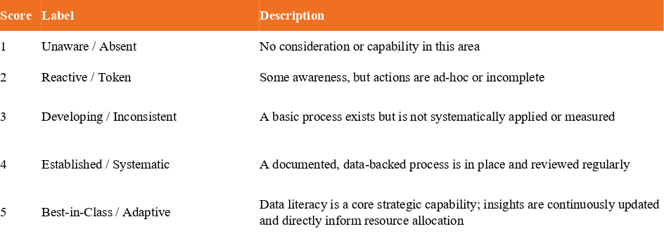
- Honestly score your current practice on the 1‑to‑5 scale provided.
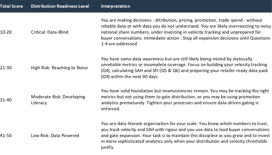
- Tally your total score and use the Scoring Summary to determine your Data Readiness Level.
- Address the lowest‑scoring questions within your next quarterly business review.
The full Small Brand Data Playbook—which includes a one‑page Nielsen metrics tracker, a buyer meeting data script, and a guide to accessing affordable retail data—is available for purchase. But the diagnostic below will tell you where you stand today.
Disclaimer
This Nielsen Data Audit Checklist, including all diagnostic questions, expanded explanations, scoring rubrics, and the data readiness interpretation, is provided for informational and educational purposes only. It does not constitute professional business, financial, legal, or data analytics advice.
The metrics and concepts referenced are based on publicly available descriptions of NielsenIQ Retail Measurement Services and Consumer Panel Data, as well as general FMCG industry practices. NielsenIQ is a registered trademark of Nielsen Consumer LLC. This checklist is not affiliated with, endorsed by, or sponsored by NielsenIQ or any of its affiliates.
The scoring system and readiness classifications are designed as a self‑assessment framework to help small FMCG brands evaluate their data literacy and usage. They are not a substitute for consultation with qualified data analysts, retail strategists, or financial advisors. Statistical reliability thresholds, coverage universes, and data availability vary by market, category, and provider. Users should verify the specific parameters of their own data contracts and consult their data provider for technical specifications.
The author and publisher make no representations or warranties, express or implied, regarding the accuracy, completeness, or suitability of the information contained in this checklist. To the fullest extent permitted by law, the author and publisher disclaim all liability for any loss, damage, or expense—financial or otherwise—arising from reliance on this material.
By using this checklist, you acknowledge that you have read and understood this disclaimer. If you are uncertain about the interpretation or reliability of any market data you are using to make business decisions, consult a qualified data analytics professional or your data provider’s technical support team.
The 10 Diagnostic Questions
Question 1: Data Source Clarity
The Question: Do I know whether the numbers I am looking at come from retail audit data (POS) or consumer panel data, and do I understand the fundamental difference between what they measure?
Expanded Explanation:
NielsenIQ provides two distinct data sets. Retail Measurement Services (RMS) tracks sales from retailers to consumers at specific outlets—it tells you what sold, where, at what price. Consumer Panel Data tracks what actual households buy over time—it tells you who bought it, how often, and whether they switched brands. These answer entirely different business questions. POS data is your source for velocity, weighted distribution, and category ranking. Panel data is your source for trial rate, repeat rate, and shopper loyalty. If you confuse the two—for example, using panel data to judge store‑level velocity—you will make expensive mistakes. Most dangerously, a small brand might buy panel data too early, when its distribution is too thin to generate statistically reliable household sample sizes. You must know which data you are looking at and what it can—and cannot—tell you.
Scoring Rubric:
1: I do not know the difference between POS and panel data. I look at whatever numbers are shared with me by a retailer or distributor.
2: I vaguely understand the difference but have never verified the source of the numbers I use for decision‑making.
3: I can identify whether a report is POS or panel, but I do not consistently apply the correct interpretation framework to each.
4: I maintain clear documentation of which data sources feed which decisions. POS data drives distribution and velocity tracking; panel data (when affordable and statistically viable) drives consumer behaviour analysis.
5: I have trained my entire commercial team on the difference between POS and panel data. Every report we produce clearly labels its data source, coverage universe, and margin of error. We do not make decisions based on data whose provenance we cannot trace.
Question 2: Coverage Check
The Question: What is the store universe this report covers? Does it include the channels where I am actually distributed, or only modern trade?
Expanded Explanation:
Many standard Nielsen reports cover only the modern trade universe—hypermarkets, supermarkets, and convenience chains. If your brand is distributed heavily through kedai runcit, Chinese medical halls, independent pharmacies, or e‑commerce platforms, the national share number in your report is missing a huge portion of your actual sales. You may be reading a 0.8% national share when your true share—including channels not covered by the report—is 3.2%. Conversely, your competitor may appear much larger simply because they have stronger modern‑trade distribution, which the report captures fully, while your strength lies in channels the report ignores. Always check the coverage notes before reacting to any number. Also, in the modern trade universe, Nieslen does not track every chain like Jaya Grocer at this time in writing. These chains are numbers are usually extrapolated.
Scoring Rubric:
1: I have never checked what store types are included in the Nielsen report I use. I assume it covers everything.
2: I know the report is modern‑trade only, but I have not quantified what percentage of my actual sales that represents.
3: I have estimated the percentage of my sales that occur outside the measured universe but do not adjust my interpretation of the data accordingly.
4: I maintain a clear mapping of my own sales by channel against the Nielsen universe. When I read a report, I mentally adjust for the channels I know are excluded.
5: I use a data source (or a combination of sources, including direct retailer sell‑out and e‑commerce data) that covers at least 80% of my actual distribution. I know the exact coverage gap and can articulate it in a buyer meeting.
Question 3: Sample Size Awareness
The Question: Is my brand’s distribution broad enough to produce statistically reliable national projections, or am I reading directional tea leaves?
Expanded Explanation:
Nielsen data works by projecting a sample of stores to represent the total market. For the projection to be reliable, your brand must be present in a sufficient number of stores within the sample. When your brand is in only 50 or 100 doors nationally, the number of sample stores that actually carry your product is tiny. The resulting national share estimate is statistically noisy—it can swing by 30‑50% from one reporting period to the next without any real change in your business. As referenced in the original post, many advanced promotional analytics simply do not work for brands selling less than $50 million nationally because of this thin‑sample problem. You must recognise when a number is precise‑looking but fundamentally unreliable and resist the urge to build strategy around it.
Scoring Rubric:
1: I treat every number in my Nielsen report as equally accurate. I do not consider sample size.
2: I am aware that small brands have sample‑size issues, but I have never asked my data provider for the statistical confidence interval of my brand’s share.
3: I know my national share number is likely noisy, but I still use it in pitch decks without caveats.
4: I have requested and reviewed the coefficient of variation (CV) or confidence interval for my key metrics. I focus on metrics with acceptable statistical reliability and treat high‑CV numbers as directional only.
5: I maintain a formal “data quality” threshold: if a metric’s CV exceeds 20%, it is flagged as directional only and is not used for compensation, investment decisions, or buyer negotiations. I prioritise metrics (like store‑level USPW from my own shipments or a single retailer’s sell‑out data) that I can measure with certainty.
Question 4: Velocity Tracking
The Question: Do I know my USPW (Units Per Store Per Week) in my top 20 stores? Is it stable, climbing, or declining?
Expanded Explanation:
For a brand under RM5 million, velocity is the single most important health metric. It measures how fast your product sells where it is actually available. National share, weighted distribution, and even total revenue can mislead you—velocity cannot. A strong USPW that is stable or climbing is your best argument for more shelf space. A weak or declining USPW is the signal that you must fix product, pricing, or promotion before you add a single new door. Your top 20 stores are likely generating a disproportionate share of your revenue; you must know exactly how fast each one is selling and whether that speed is improving.
Scoring Rubric:
1: I do not track USPW. I look at total monthly sales and the number of doors I am in, but I do not divide the two.
2: I have a rough average USPW in my head, but it is not documented, tracked over time, or broken down by store.
3: I track average USPW monthly but not by individual store. I cannot identify my fastest and slowest stores.
4: I maintain a store‑level USPW tracker for all active doors, updated monthly. I review the top 20 and bottom 10 stores in a monthly sales meeting.
5: My USPW tracking is live (or as close to real‑time as possible), segmented by channel and region, and directly linked to a traffic‑light system. I can tell you within 30 seconds the USPW trend of any store in my top 50, and I use this data to gate all new distribution entries.
Question 5: Share Among Handlers (SAH)
The Question: Do I know my Share Among Handlers—not just my national market share?
Expanded Explanation:
Market share tells you your percentage of total category sales, including stores where you are not even listed. Share Among Handlers (SAH) tells you your share only among the stores that actually stock your product. A small brand with 0.5% national share might have a 12% SAH in the stores where it is present—a far more compelling story for a buyer. SAH answers the question: Where we are on the shelf, are we winning? If SAH is strong, you have a distribution problem (you need to be in more stores). If SAH is weak, you have a product or pricing problem (consumers see you but choose something else). You cannot diagnose your business without this metric.
Scoring Rubric:
1: I have never heard of Share Among Handlers. I only look at national market share.
2: I am aware of the concept but have never calculated it for my brand.
3: I have calculated SAH from my own sales data for my largest retail customer, but not across all measured channels.
4: I receive a formal SAH metric from my data provider or calculate it systematically from my POS data for all tracked channels. I review it quarterly alongside national share.
5: SAH is my primary external performance metric. I set SAH targets by channel and use them to allocate trade spend. My buyer presentations lead with SAH, not national share, and I can explain the trend over the last eight quarters.
Question 6: Fair Share Index (FSI)
The Question: Is my Fair Share Index above or below 1? If below, what is my plan to fix conversion before I add more doors?
Expanded Explanation:
FSI compares your market share to your share of distribution. A brand with 5% of category distribution and 5% of category sales has an FSI of 1.0—it is punching exactly at its weight. An FSI above 1 means you are converting shelf presence into sales more efficiently than your distribution footprint would predict. An FSI below 1 means your distribution is not converting. Perhaps you are in the wrong stores. Perhaps your shelf placement is poor. Perhaps your packaging is invisible. Perhaps your price is too high. Whatever the cause, an FSI below 1 is a flashing warning light that you should not add more doors until you fix conversion in the doors you already have. Expanding distribution with an FSI below 1 is death by distribution, accelerated.
Scoring Rubric:
1: I have never calculated FSI. I do not link my distribution footprint to my sales efficiency.
2: I have a vague sense that some stores sell better than others, but I have not formalised an FSI metric.
3: I calculate FSI annually from my POS data, but I do not use it to gate distribution expansion decisions.
4: FSI is calculated quarterly and segmented by channel. An FSI below 1 triggers a mandatory conversion‑improvement plan (packaging, placement, pricing, or promotion) before new doors are approved.
5: I maintain a dynamic FSI model that adjusts for seasonal effects and channel mix. My commercial team has a standing rule: no net new distribution if trailing six‑month FSI is below 1.0. Exceptions require a documented, board‑level sign‑off.
Question 7: Trial and Repeat Rate (Panel Data)
The Question: Do I have any data—from Nielsen panel, Shopee, or my own systems—that tells me whether first‑time buyers are coming back?
Expanded Explanation:
POS data tells you what sold. Panel data tells you whether anyone came back. A brand can have strong velocity and still be in trouble if its repeat rate is low—because velocity is being propped up by constant trial, which is expensive and unsustainable. Conversely, a brand with low trial but strong repeat has a winning product that simply needs more awareness. For a brand under RM5 million, panel data may be too expensive and statistically unreliable at national level. But you can approximate these metrics through your own e‑commerce data (Shopee repeat purchase rate, DTC website returning‑customer rate) or through a single retailer’s loyalty card data. The critical distinction between a trial problem and a repeat problem is the most important diagnostic in FMCG.
Scoring Rubric:
1: I do not track repeat purchase at all. I measure success by total units sold.
2: I have a gut feel for whether people re‑order, but no data.
3: I track repeat purchase rate on my Shopee store or DTC website, but not across physical retail.
4: I have access to either formal panel data (through Byzzer or a Nielsen subscription) or a robust proxy (e‑commerce repeat rate + a single key retailer’s loyalty‑card data) that allows me to estimate trial and repeat rates. I review these metrics quarterly.
5: Trial and repeat rate are core KPIs. I segment my marketing investment by whether I need to drive trial (sampling, demos, advertising) or repeat (quality improvement, loyalty programme, pack size optimisation). I have a documented playbook for each scenario.
Question 8: Category Context and Benchmarks
The Question: Have I benchmarked my performance against challenger brands of similar size, not against the category leader?
Expanded Explanation:
Comparing your 0.8% national share to Nestlé’s 35% share is meaningless. You operate with different distribution, different trade spend, and different consumer awareness. The correct benchmark is other challenger brands in your category—brands with similar distribution breadth, similar price tier, similar age. As referenced in the original post, manufacturers outside the top 100 have contributed 31% of annual FMCG growth in the Asia‑Pacific region. Understanding where your growth rate sits relative to other small brands gives you a realistic performance benchmark and a credible story for investors and buyers. You are not failing because you are not Nestlé; you may be winning because you are growing faster than the other challengers.
Scoring Rubric:
1: I only compare myself to the market leader. I feel either hopeless or delusionally optimistic.
2: I am aware that small‑brand benchmarks exist, but I do not have access to that data or I have not sought it out.
3: I occasionally read category reports that mention challenger brand growth, but I have not systematically benchmarked my own performance.
4: I maintain a formal “challenger peer set”—five to eight brands of similar size, distribution, and price tier—and benchmark my USPW, SAH, and growth rate against theirs quarterly.
5: I use my challenger benchmarks not only to measure performance but to inform my strategy. If a peer is achieving significantly higher SAH with similar distribution, I investigate what they are doing differently (packaging, promotion mechanic, shelf placement) and test adaptations. I present my challenger‑relative performance in buyer meetings to position myself as “the fastest‑growing small brand in the category.”
Question 9: Retailer Readiness
The Question: If a buyer asked me for my USPW in their chain right now, could I answer the question with data, or only with hope?
Expanded Explanation:
This is the ultimate test of your data readiness. In a range review, the buyer cares about one thing: how fast your product sells in her stores. If you cannot provide that number instantly and credibly, you are not a partner; you are a passenger. The buyer has her own internal velocity data, and she will use it. If your number does not match hers, or if you have no number at all, you lose the negotiation. You must walk into every buyer meeting with your USPW for that specific chain, your trend over the last six months, and your plan for improvement.
Scoring Rubric:
1: I cannot answer that question. I do not have chain‑level velocity data.
2: I could provide a rough estimate after checking a few spreadsheets, but it would take me several hours.
3: I have chain‑level velocity data for my top two retail partners, but it is not regularly updated or formatted for a buyer presentation.
4: I maintain a retailer‑ready one‑pager for each major chain, updated monthly, showing USPW, trend, SAH, and FSI for my brand versus the category.
5: My velocity data is so current and credible that I proactively share it with my retail buyers before they ask. My buyer meetings begin with a joint review of the numbers. I have built a reputation as a data‑literate supplier, which gives me preferential access to promotional slots and new store listings.
Question 10: Promotion Analytics Limitations Awareness
The Question: Am I aware that advanced promotional analytics (price elasticity, uplift modelling) are likely unreliable for my brand at my current scale, and do I avoid making trade spend decisions based on numbers that are statistically unsound?
Expanded Explanation:
Nielsen and other data providers offer sophisticated promotion analytics—price elasticity models, promotion uplift studies, ROI calculators. These tools require large baseline velocities and broad distribution to generate reliable outputs. For a brand with thin distribution and low weekly sales per store, the model outputs are essentially random numbers wearing a suit. Using them to decide whether to run a 20% discount or a BOGO mechanic is dangerous. At your scale, simpler methods—direct A/B testing in matched stores, breakeven calculations using the P&L Sensitivity Tool from the COGS & Promotions toolkit, and post‑promotion velocity comparisons—are far more reliable and cost‑effective. You must recognise the boundary of statistical reliability and not be seduced by the sophistication of tools that are not built for you.
Scoring Rubric:
1: I am not aware that promotion analytics have scale requirements. I would use any tool my data provider offered me.
2: I have used promotion analytics in the past without questioning their reliability for my brand size.
3: I am aware of the limitations but still occasionally rely on modelled outputs because I do not have an alternative decision framework.
4: I have formally assessed the statistical reliability of any promotion analytics I have been offered and concluded they are not appropriate for my current scale. I use simpler, direct‑measurement methods for promotion evaluation.
5: I maintain a documented policy: we do not use modelled promotion analytics until our distribution exceeds a defined threshold (e.g., 500 stores with USPW > 2.0). Until then, all promotion decisions are guided by A/B testing, breakeven calculations, and post‑promotion velocity measurement. This policy is understood and enforced across the commercial team.
Get the Full Small Brand Data Playbook
The 10 questions above are the diagnostic. The full Small Brand Data Playbook (available for purchase) provides the prescription:
One‑Page Nielsen Metrics Tracker – a simple template that extracts only the five metrics that matter for a small brand (USPW, Weighted Distribution, SAH, FSI, Repeat Rate) and ignores the noise.
Buyer Meeting Data Script – a prepared narrative that turns your velocity and SAH data into a compelling argument for more shelf space, better placement, and promotional support.
Affordable Data Access Guide – a step‑by‑step guide to accessing NielsenIQ’s Byzzer platform, leveraging free reports, and negotiating data‑share agreements with retailers.
Promotion Measurement Toolkit – a set of simple, statistically appropriate methods for measuring promotion effectiveness at low distribution levels, including A/B testing templates and post‑promotion velocity analysis.
Data‑Driven Expansion Gating Policy – a template policy document that codifies the rules for when to expand distribution based on USPW, SAH, and FSI thresholds.
[Purchase the Full Small Brand Data Playbook Here]
Nielsen data is a compass, not a map. For a brand under RM5 million, the compass needle wobbles. This checklist tells you how to hold it steady.
