

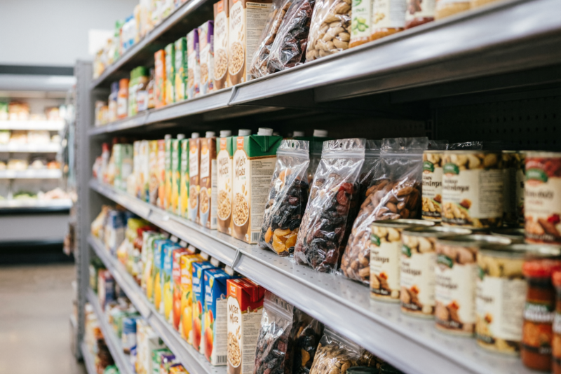
Eye level is buy level. Research shows products at 4-5.5 feet receive 35-45% more visual attention.
But if you’re a small FMCG brand in Malaysia, you won’t get that slot. The prime shelf at AEON or Village Grocer belongs to the giants who pay hefty listing fees or market leaders.
Your reality? The ankle graveyard. Shelf Level 6, Position D.
But losing premium placement doesn’t mean losing the sale. It means mastering The 3-Foot Rule—designing packaging specifically for the distance and angle from which a standing shopper actually views the bottom shelf.
What Is the 3-Foot Rule in FMCG Packaging Design?
Shoppers scan shelves from three to six feet away and make selection decisions in as little as five seconds. From that distance, looking downward, your packaging’s words disappear.
What remains:
- Color (strongest signal)
- Shape (silhouette and depth cues)
- Symbols (icons and high-contrast logos)
Appropriate color use alone can boost brand recognition by 80%. The trick is designing for three visual distances: far (color block), mid (brand name and primary image), and near (details in hand). On the bottom shelf, the “far” and “mid” views are disproportionately important because the shopper never gets to “near” unless you first win their peripheral attention.
The 3-Foot Rule Playbook: 3 Tiers of Bottom-Shelf Survival
Tier 1: The Billboard Color Block
Drop the beige. Drop the tasteful pastel. You need a solid, saturated block of colour that does not exist elsewhere in your category.
If the bottom shelf is drowned in red (chili sauces) or white (dairy), claim electric green, vivid plum, or deep tangerine. The Squint Test is mandatory: hold your pack at arm’s length near the floor, squint until all detail blurs. If your brand colour disappears, you fail.
Tier 2: The Top-Down Readability Hack
Malaysian shoppers do not kneel for bottle of sauce. Your label gets viewed from a steep 45-degree downward angle, not straight on.
Key typing rules for bottom shelf:
- Sans-serif fonts in bold (thin scripts disappear).
- Minimum 10-point type for product name—14-point is better.
- High contrast—black on white remains legible even under harsh fluorescent lighting.
- Stack text vertically if pack width is narrow. It increases the “hitbox” of readability from above.
Tier 3: The Shape Shift
In a sea of identical round jars and rectangular pouches, a structurally unique pack is a shortcut to attention.
The bottom shelf rewards forward thrust or unusual width—a hexagonal box, a short-and-wide jar, a custom die-cut label edge that breaks the visual rhythm. Shoppers process packaging in 0.3-1.5 seconds; a shape that differs from everything next to it triggers an automatic “what’s that?” glitch in their scan pattern. That tiny pause is your conversion moment.
The Malaysian Context: Why the Bottom Shelf Is Harder Here
Western shoppers are trained to hunt the bottom shelf for value. In Malaysian retail—99 Speedmart, Lotus’s, AEON—the bottom rung is different. It’s often reserved for:
- Private label stock the retailer actively promotes.
- Oversized staples like 5kg rice bags.
- Dust.
Display fees for eye-level and end-cap displays lock local SMEs out of premium visibility. You’re fighting not just multinational brands but the store’s own margin-driven inventory. That makes a distinctively designed bottom-shelf presence not just helpful—it’s the only visibility lever you truly control.
Case Study: Laoban’s Bottom-Shelf Breakthrough
When Laoban, an Asian American dumpling brand, entered retail during COVID, they couldn’t afford prime freezer-door real estate. Their response: a deliberately unconventional package design.
Instead of typical frozen-dumpling photos, they used a sleek, minimalist layout with quirky blob-like characters and a muted-peach colour palette. It looked like nothing else in the freezer aisle.
Founder Patrick Coyne explained: “It was very simple and colorful. It was very different from anything else in the aisle. When people walked by, they would say ‘oh, what is that?'”
Curiosity—generated entirely from an unexpected visual identity—helped them secure chain distribution and a loyal following from a low-visibility starting position. No celebrity endorsement. Just packaging that honoured the 3-Foot Rule.
The 3-Foot Rule Audit Checklist (RM0 Required)
- Squint Test: From 3-4 feet, does a colour block stand out against the shelf edge?
- Colour Contrast: Is your primary colour opposite the category norm?
- Top-Down Legibility: Can I read the brand name while looking down at 45 degrees?
- Font Size: Is critical text at least 10pt, sans-serif, high contrast?
- Shape Difference: Does my pack shape differ from 90% of bottom-row neighbours?
- Lighting Check: Have I tested under harsh fluorescent retail light, not just a studio?
The One Takeaway
If you’re a small brand, you’re not in the packaging business. You’re in the peripheral vision business.
You will never out-spend Nestlé for eye-level shelf at AEON. But you can own the corner of the shopper’s eye. The right colour block, the right top-down typography, the right shape.
That’s how a RM28.90 jar of premium peanut butter can beat a RM35 million advertising budget—from the bottom shelf.
